Protocol: A beautiful starting point for your next API documentation site
- Date
 Adam Wathan
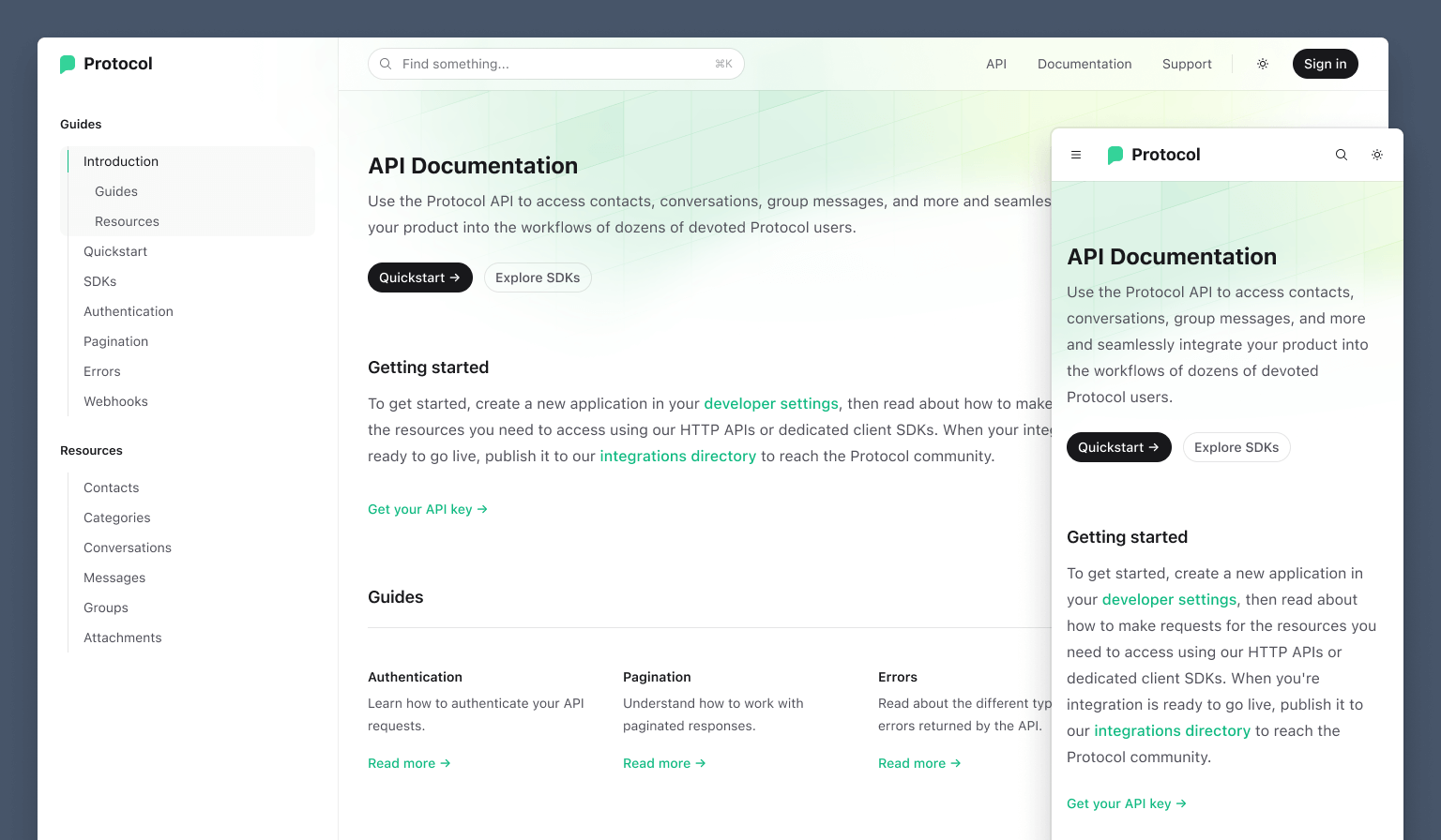
It’s been months in the making but I’m excited to finally release our next website template — Protocol, a beautiful starter kit for building amazing API reference websites.

Powered by Next.js and MDX and styled with Tailwind CSS, it’s built exactly the way we’d build our own API reference documentation.
Play with the live demo or download the source if you’ve got a Tailwind UI all-access license — it’s a free update of course for all-access customers.
Loaded with design details
As usual we had a lot of fun getting carried away with the design, and putting that extra layer of polish on things to make it really delightful to browse the site.
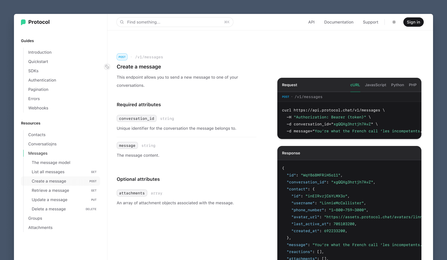
We’ve got sticky code blocks that stay in view as you scroll through the request and response details for that endpoint:
There’s also this beautiful hover effect on the homepage cards — it follows your mouse cursor with this gradient glow that uncovers a subtle background pattern:
My favorite detail though has to be the sidebar navigation, which tracks the visible page content but using a sort of “minimap” strategy, where all visible page sections are highlighted:
Watching this animate as you scroll through the page is really a sight to behold — props to Framer Motion for doing the heavy lifting here as usual. Even if I absolutely hated React I’m pretty sure I’d still use it just to use this library, it’s really that good.
The developer experience we’d want ourselves
We spent a lot of time deciding how to wire up the actual content on this one. We explored a bunch of different options for autogenerating documentation using different standards, but for my tastes anyways it all felt a little restrictive.
Personally I want to be able to just write exactly the documentation I want. So for Protocol, we optimized for maximum control but with a lot of authoring conveniences that make it really easy to write exactly what you want, fast.
You write your endpoint documentation in MDX, mixing in a handful of little components we provide to structure things quickly:
## Create a message {{ tag: 'POST', label: '/v1/messages' }}

<Row>
  <Col>

    Publishes a new message to a specific conversation.

    ### Required attributes

    <Properties>
      <Property name="conversation_id" type="string">
        Unique identifier for the conversation the message belongs to.
      </Property>
      <Property name="message" type="string">
        The message content.
      </Property>
    </Properties>

  </Col>
  <Col sticky>

    <CodeGroup title="Request" tag="POST" label="/v1/messages">

    ```bash {{ title: 'cURL' }}
    curl https://api.protocol.chat/v1/messages \
      -H "Authorization: Bearer {token}" \
      -d conversation_id="xgQQXg3hrtjh7AvZ" \
      -d message="You're what the French call 'les incompetents.'"
    ```

    ```js
    import ApiClient from '@example/protocol-api'
    const client = new ApiClient(token)
    await client.messages.create({
      conversation_id: 'xgQQXg3hrtjh7AvZ',
      message: 'You're what the French call 'les incompetents.'',
    })
    ```

    </CodeGroup>

    ```json {{ title: 'Response' }}
    {
      "id": "gWqY86BMFRiH5o11",
      "conversation_id": "xgQQXg3hrtjh7AvZ",
      "message": "You're what the French call 'les incompetents.'",
      "reactions": [],
      "created_at": 692233200,
    }
    ```

  </Col>
</Row>
This will produce documentation that looks like this:

To really nail the authoring experience, we even built mdx-annotations — a new library that brings the annotations feature we loved when working with Markdoc over to MDX.
It lets you pass props into tags in MDX content by annotating them with an object, like this heading:
## Create a message {{ tag: 'POST', label: '/v1/messages' }}…which is translated into this JSX:
<Heading level={2} tag="POST" label="/v1/messages">Create a message</Heading>This lets you move quite a bit faster because you can keep writing in Markdown and not have to drop into raw JSX just to pass along some extra data.
Adaptable design
I think this template is going to be really useful to lots of people right off-the-shelf, so it was important to us that it was easy to customize the design to match your brand.
We deliberately designed the illustrated background pattern we use in the site to feel “on brand” for basically anyone — you can tell it’s the work of a professional designer but it’s simple and leans into the “technical” motif, which is something that all API reference sites are going to have in common anyways.

We built the pattern in code rather than exporting it as an asset with all of the colors baked in, so it’s easy to tweak it to match your own color scheme.
For syntax highlighting, we’re using Shiki with the css-variables theme, which makes it easy to update the syntax highlighting for your brand by picking just 9 colors:
:root {
  --shiki-color-text: theme('colors.white');
  --shiki-token-constant: theme('colors.emerald.300');
  --shiki-token-string: theme('colors.emerald.300');
  --shiki-token-comment: theme('colors.zinc.500');
  --shiki-token-keyword: theme('colors.sky.300');
  --shiki-token-parameter: theme('colors.pink.300');
  --shiki-token-function: theme('colors.violet.300');
  --shiki-token-string-expression: theme('colors.emerald.300');
  --shiki-token-punctuation: theme('colors.zinc.200');
}
This is a hell of a lot less work than trying to craft your own theme from scratch!
In addition to the four icons we’ve used in our demo, we’ve included another 24 icons for a bunch of common API resource types:
Check out this screenshot, where we’ve adapted the Protocol template as if it were being used by our friends at ConvertKit to power their API reference:
Looks a lot different at a quick glance, but when you really dig in there’s actually not much that has changed here at all — just updating some button and link colors, the logo, adjusting the gradient in the illustration, and picking some different syntax highlighting colors.
Dark mode
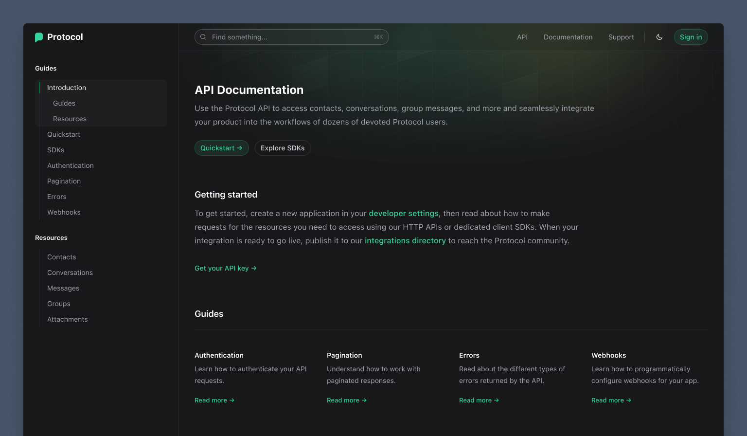
Naturally the site includes dark mode support — it’s meant for developers, do you really think we could possibly be that ignorant? You would never forgive us.

The dark mode version has lots of its own cool design details too — I love the different primary button treatment for instance.
Command palette with Algolia DocSearch integration
We love Algolia for documentation search, and we use it for the Tailwind CSS website as well as in our Syntax template.
We’ve wired it up for Protocol as well, but this time using Algolia’s headless autocomplete library so we had total control of the search UI:
The nice thing about this approach is we can use regular old utility classes to style everything instead of writing custom CSS to style an already-styled widget, which just feels a lot more right in a Tailwind CSS project.
And that’s it — one last Tailwind UI template to finish out 2022! We’ve got another one almost ready to go too, so keep an eye out for that in the new year. Going to have some pretty damn exciting Tailwind CSS v4.0 news to share soon too!

